The Psychology of Design: How Colours Impact Mood and Productivity
Colour isn’t just about aesthetics—it’s a powerful tool that shapes emotions, influences decisions, and enhances productivity. Explore the science behind colour psychology and how strategic design choices can create spaces that inspire, energize, and support well-being.

Colour is more than just decoration—it’s a powerful force that shapes our emotions, influences our decisions, and even alters our physical responses. From the calming blues of a spa to the energetic reds of a bustling café, the colours around us silently guide our experiences in ways we may not even realize.
As we enter the spring season, a time of renewal and fresh energy, it’s the perfect moment to explore how colour influences our daily lives. Just as the shift from winter to spring lifts our spirits, the right colour choices in our environments can enhance productivity, creativity, relaxation, or even appetite.
For business owners, understanding colour psychology can lead to better customer engagement and employee well-being. For homeowners, it can mean creating spaces that feel like a true reflection of comfort and personality. Whether you’re designing a workplace, a retail space, or your own home, the colours you choose can transform not just the aesthetics but also the way people feel and interact within the space.
In this blog, we’ll dive deeper into the psychology of colour—how different hues impact mood, the science behind our emotional responses, and how you can use this knowledge to design spaces that truly work for you. Plus, we’ll explore the latest colour trends for 2025, giving you insight into the shades that will define the future of design.

THE SCIENCE BEHIND
COLOUR PSYCHOLOGY
Our perception of colour is deeply rooted in both biology and culture. When light enters our eyes, it stimulates the retina, which then sends signals to the brain's hypothalamus—a region controlling hormones and emotions. This process explains why certain colours can evoke specific feelings universally. However, cultural backgrounds and personal experiences also play significant roles in shaping our individual responses to different hues.
BREAKING DOWN THE COLOUR
SPECTRUM: HOW DIFFERENT
COLOURS AFFECT MOOD
- Warm Colours (Reds, Oranges, Yellows): These hues are known to evoke energy, passion, and warmth. Red can stimulate excitement and appetite, making it popular in dining areas. Orange fosters enthusiasm and creativity, ideal for collaborative spaces. Yellow, associated with happiness and optimism, can brighten moods but should be used sparingly to avoid overstimulation.
- Cool Colours (Blues, Greens, Purples): Cool tones generally have a calming and soothing effect. Blue promotes tranquility and focus, making it suitable for workspaces. Green, reminiscent of nature, brings balance and relaxation, perfect for areas intended for rest. Purple combines the stability of blue and the energy of red, often linked to luxury and creativity.
- Neutral Colours (Whites, Grays, Beiges, Blacks): Neutrals provide versatility and balance in design. White signifies cleanliness and simplicity but can feel sterile if overused. Gray offers sophistication and neutrality, serving as a backdrop that allows other colours to stand out. Beige brings warmth without overwhelming the senses. Black adds depth and elegance but can be overpowering in large quantities.
- Pastels vs. Bold Hues: Pastel colours, with their soft and muted tones, create a sense of calm and serenity, making spaces feel open and airy. Bold hues, on the other hand, are vibrant and attention-grabbing, injecting energy and personality into a room. The choice between pastels and bold colours depends on the desired emotional impact and function of the space.

DESIGNING WITH EMOTION IN MIND:
STRATEGIC USE OF COLOUR
The key to using colour effectively is in finding the right balance between bold and muted tones. A bright feature wall can be complemented by softer, neutral elements to prevent visual fatigue, while a more subdued palette can be elevated with strategic pops of vibrant colour to maintain interest and dynamism. Understanding colour psychology allows for intentional design choices that align with the desired emotional response:
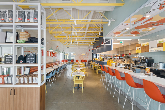
- Restaurants: Utilizing reds and yellows can stimulate appetite and create a lively atmosphere, while greens can convey freshness and health, appealing to health-conscious patrons.
- Retail Spaces: Bright, bold colours can attract attention and encourage impulse purchases, whereas muted, sophisticated palettes may appeal to luxury shoppers seeking a premium experience.
- Workspaces: Incorporating blues can enhance focus and productivity, greens can reduce anxiety and promote calmness, and touches of yellow can inspire creativity and innovation.
- Healthcare & Wellness Centers: Soft blues and greens are often used to create a serene environment conducive to healing and relaxation, helping to put patients at ease.

BRINGING IT HOME:
APPLYING COLOUR PSYCHOLOGY
TO PERSONAL SPACES
For homeowners, colour choices can significantly influence the ambiance and functionality of different areas:
- Bedrooms: Soft blues or lavenders can create a peaceful retreat, promoting restful sleep and relaxation.
- Kitchens: Warm colours like yellow or earthy tones can make the space feel inviting and stimulate conversation during family gatherings.
- Living Rooms: Neutral palettes provide a versatile foundation, allowing for easy updates with accent pieces and fostering a comfortable environment for socializing.
It's essential to consider personal preferences and how specific colours make you feel, as individual experiences can influence emotional responses to colour. Additionally, lighting plays a crucial role in colour perception; natural light can enhance colours, while artificial lighting can alter their appearance, affecting the room's mood. A good rule of thumb is to sample colours within the design space at different times of day to get a true feel for the emotional response they bring.
COLOUR TRENDS FOR 2025
As we look ahead, certain colours are set to make a significant impact in design:
- Future Dusk: Identified as the Colour of the Year for 2025 by WGSN and Colouro, Future Dusk is a dark, moody hue that sits between blue and purple. It embodies a sense of mystery and escapism, aligning with themes of transition and change. This colour offers a fresh take on traditional dark blues, feeling both familiar and futuristic. Its versatility makes it suitable for various applications, from classic styles to modern, gender-inclusive designs.
- Starry Night: SICO's Colour of the Year for 2025, Starry Night, is a deep, bold purple inspired by the night sky and purple basil. This rich hue embraces the trend of maximalism, allowing for expressive and personalized spaces. Historically associated with royalty, purple conveys elegance and exclusivity, making it a compelling choice for those looking to make a statement in their interiors.
- Mocha Mousse: Pantone’s unveiled Colour of the Year for 2025, Mocha Mousse, is a warm, rich brown hue evokes the comforting essence of chocolate and coffee, blending sophistication with a sense of indulgence. Its versatility makes it suitable for various applications, offering a grounded yet modern aesthetic that aligns with contemporary desires for comfort and understated elegance.
Incorporating these trending colours can refresh your space and align it with contemporary design movements, all while considering the psychological impacts of colour choices.

COLOUR TRENDS:
A REFLECTION OF THE TIMES
Colour trends don’t exist in isolation—they often reflect the world around us. Throughout history, interior design has mirrored the collective mood of society. In times of economic uncertainty or global turmoil, we gravitate toward muted, neutral tones that provide a sense of comfort and stability. For example, recession-era palettes have often leaned towards earthy greens, soft browns, and warm neutrals, offering reassurance amidst uncertainty. Conversely, periods of optimism and prosperity tend to spark a resurgence of bold, vibrant hues that express creativity and confidence—like the bright, electric colours that dominated the 1980s post-recession.
For 2025, colour predictions suggest a balance between these two tendencies. WGSN and Colouro’s Future Dusk, a moody, deep blue-violet, reflects a growing interest in introspection and digital escapism, while SICO’s Starry Night, a deep midnight blue, offers a calming yet sophisticated foundation for modern spaces. Meanwhile, Pantone’s Colour of the Year, Mocha Mousse, embraces warmth, comfort, and an earthy richness—signaling a collective desire for groundedness and everyday indulgence.
As we continue navigating an evolving world, the colours we surround ourselves with serve as more than just aesthetic choices—they reflect our emotions, aspirations, and the broader societal climate. Whether leaning toward soothing neutrals or embracing bold, adventurous tones, 2025’s colour trends encourage both stability and self-expression in design.

CONCLUSION
Colour wields significant influence over our emotions and behaviors, making it a vital element in both personal and professional spaces. By thoughtfully selecting hues that align with desired moods and functions, you can create environments that not only look appealing but also enhance well-being and productivity.
For more insights into the transformative power of colour and expert design advice, explore our other blog posts or contact us for a personalized interior design consultation.
.jpeg)
.jpeg)
.jpeg)